Everyone judges a book by its cover, i.e., what appeals to people, sells! The
judgment comes from the brain's visual cortex, whose work is to differentiate
things it sees through via human eyes continuously.
So, it's natural that people will judge. It's not a negative aspect. Instead,
the human brain's one of the functions through which it receives data/info and
makes correlations.
Thus, these correlations, in layman's terms, are judgments! So, no need to
worry if people judge you since you do that too! It's our nature. The only
thing is - how and for what you use it. And based on that, it'll show you
results!!
Forgive me; I got carried away a little. Let's get back to what we are here
for.
What I just mentioned in the above paragraph applies to many things in our
world, including our lives and various digital experiences from today's high-
end electronic devices - usually mobile phones, desktops, laptops, tablets,
and other electronic display devices.
By the term digital experiences, you can think of how products (both tangible
and intangible) look and how they stimulate our brain, hence us. Things we see
and observe directly impact how we experience them.
For example, the aesthetic–usability effect.
People tend to ignore a few usability shortcomings in aesthetically pleasing
products.
Thus, the more a visual design is aesthetically pleasing, the more ignorance
will be there from the users' end. And hence, visual design plays a crucial
role in developing products with top-notch aesthetics so that people can't
even notice the imperfections. Only a well-experienced designer can!!
This blog post is for you to explore -
- What is Visual Design?
- Components of Visual Design
- The relation between visual design and its usability?
- What is the role of visual design in UX?
- Visual design principles for visual designers
- How can designers create appealing user experiences that make people explore more?
- Top 5 UX design trends to stand out: Be careful!
What is Visual Design?
An excellent and people-centric visual design simplifies our lives. And the
credit goes to graphic designers that make it happen by using their
influential observations and years of experience.
“They are the design world's problem-solvers. They bring life to brands and
define a brand’s unique style and voice.”
Along with creating beautiful designs that please people, they always have a
way to explain design concepts more beautifully and why they do what they do
in their work.
Visual designers' work often overlaps with the work of the graphic design and
UI design teams. But it doesn't stop them from going beyond putting efforts
into individual plans/projects and taking full responsibility for a whole
visual brand of a company.
Moreover, “Visual design” is not a new concept but rather a more recent term
in the design world. And if one goes through a job title/job description,
visual design usually implies - preparing individual designs to own the visual
brand more comprehensively.
Working on print products is very rare for Visual designers, but it's good if
they have a strong understanding of branding, graphic design, and identity
design. With that, they also need exceptional visual messaging and
communications skills to excel in the world of design.
Components of Visual Design
You can break down any page or screen of a digital product into essential
elements of visual appearance. Basic elements of visual design are -
Lines
Lines are the most basic and foremost element of any visual design. Since a
line (straight or curved, smooth, rough, continuous, broken, thick, or thin)
is any two connected points. A line brings division and hierarchy to your
designs.
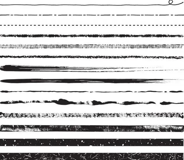 Lines with varied densities and curves. Image Source: Adobe Stock Photo
These lines help the user’s eye directly towards a specific focal point or
information you want them to stress.
You have probably heard - a good design speaks for itself! Indeed, that is the
case, and it's even true! Let me tell you how lines can create subliminal
languages.
For instance, a diagonal line indicates movement since a straight line
way cleaner and has more direct order, observe the below image from Virgin
Group's Virgin Hyperloop website -
 Image Credit: Adobe Photo Stock
It's a high-speed transportation system that reduces the traveling time from
several hours to a few minutes.
For example, if this program becomes officially available to the
public, it will take 2 minutes to reach Dallas to Fort Worth in Texas, and
vice-versa.
And if you again observe the Hyperloop track in the above image, you will see
that the lines making up the shape of a tube offer a sense of motion, hence
the idea of high speed in this most innovative form of travel in human
history.
There are two fundamental ways in which you can create a line -
- Connecting two points using a pen, brush, or other digital tools. Lines produced from this method are called “actual lines.”
- The other creates an “implied line,” appearing when two shapes meet.
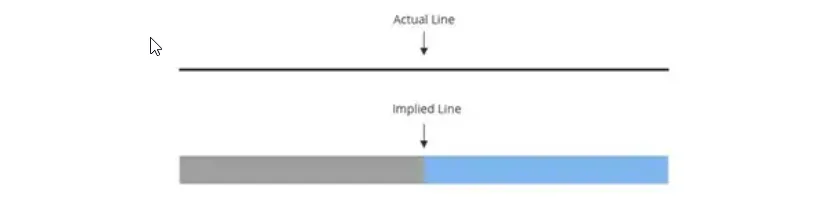 Image Credit: Adobe Photo Stock
And, when you fully grasp the power of the line, it helps you define shapes,
make divisions, and create textures, and puts you closer to creatively and
efficiently using this fundamental design element to come up with unique
designs.
Typography: Fonts
Typography refers to chosen fonts' alignment, size, color, and spacing. It is
one of the most crucial parts of graphic/visual, web, and UI design.
How you choose fonts and show them conveys a message/mood - a fun and playful
story in a blog or a serious one through which people want to learn something
new.
Typography can easily set a tone and create a visual hierarchy, showing people
what and where to look and which things are of focus.
Hence, it acts as a guide for users to read the content from start to end. For
example, Serif fonts evoke a more traditional feeling, while Sans Serif fonts
are for showing modernism in your writings.
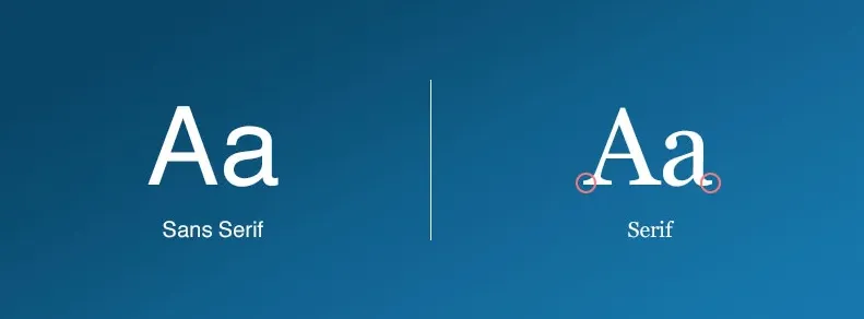 Typography for better UI and UX design
Furthermore, Larger font sizes, for example, catch the user's eye first and
signify a focal point on your page. When a smaller font is beneath it, the
reader instinctually knows that it's a subsection that will support the
heading and perhaps provide more context or information.
Minor details concerning font size, weight, and height are vital for user
interface design.
Shapes
A line comes under 2-Dimensions, but if you drag them laterally; hence, shapes
are self-contained. Every object is composed of shapes.
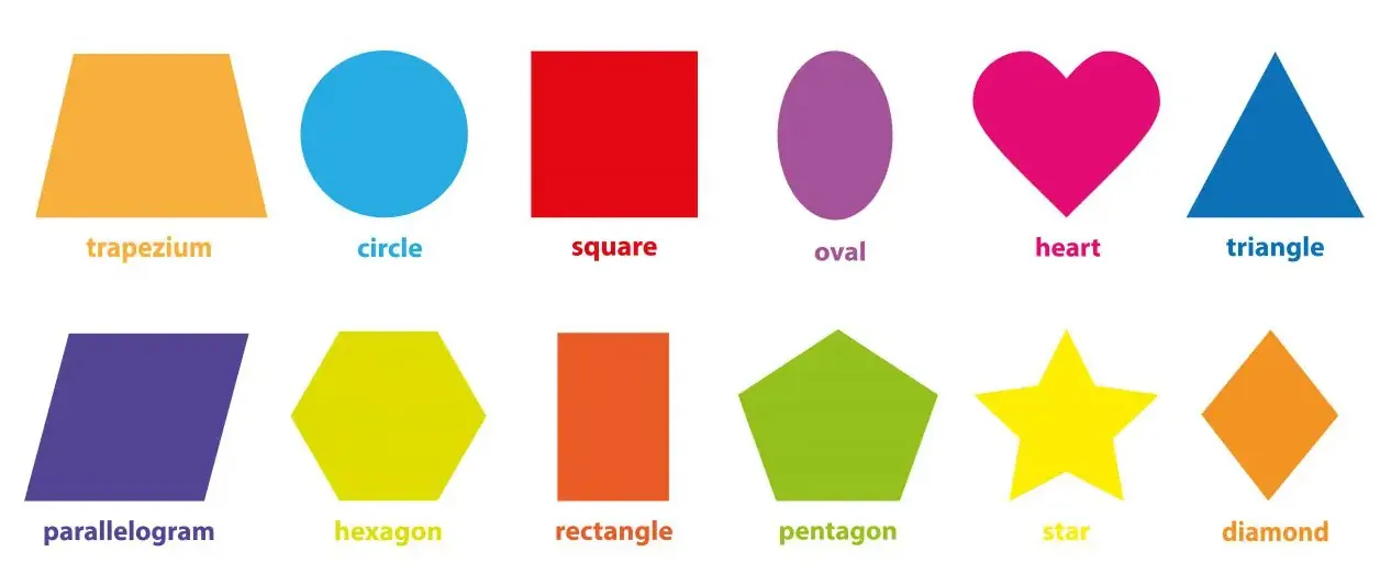 Image Source: Adobe Photo Stock
Thus, as a visual designer, you want to define the area, use lines,
differences in values, texture, color, etc.
Colors
Colors come into play in visual design when you want people to instantly differentiate
between objects of various shapes and sizes. So, selecting a color
palette and their combinations create depth and add emphasis to help organize
information.
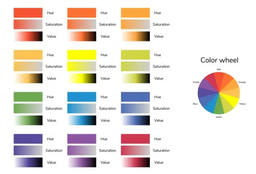 Image Credit: Adobe Photo Stock
The color theory beautifully examines how various color choices
psychologically impact the overall user experience for more curious minds.
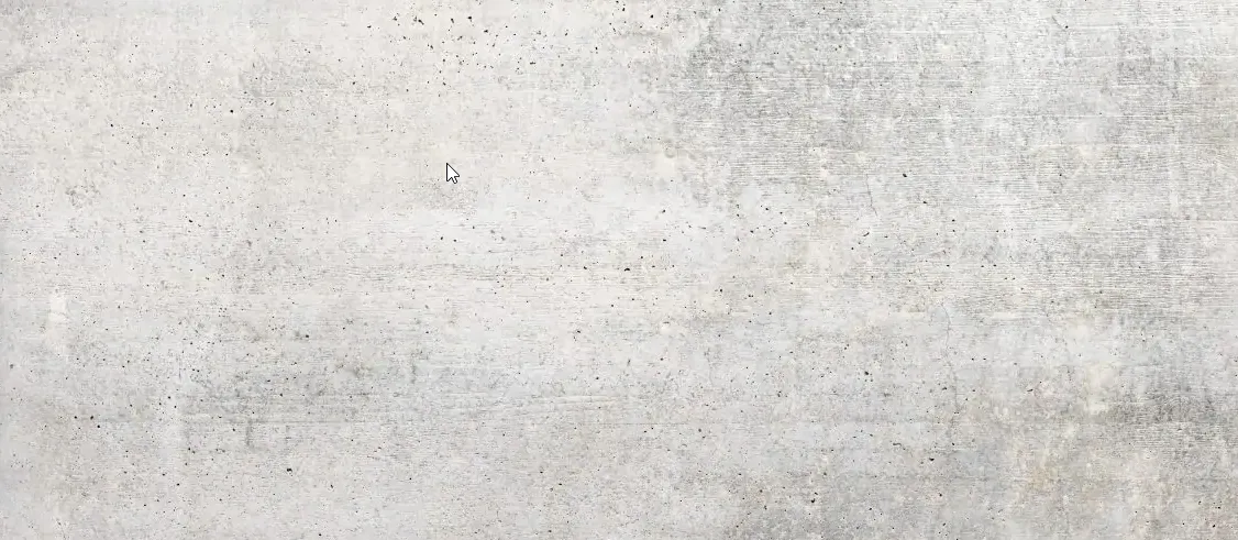
Textures
Texture refers to how one feels and perceives a surface. You need to develop a
pattern by repeating an element to create a texture.
 Stone Textile Background: Image Credit - Adobe Photo Stock
Depending on how and with what intentions you do it, it will strategically
affect the users. Meaning, do you want their attention to attract or deter.
 A white paper background: Image Source - Adobe Photo Stock
Volume/Space
Space concerns the area around an object. The space can be negative or
positive. The positive one refers to the subject or areas of interest, like a
person's face or furniture in the dining room.
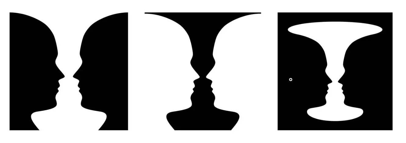 Image Source: Adobe Photo Stock
In contrast, the negative/white space tells about the background area
surrounding areas of interest.
If done correctly, white space plays a pivotal role in coming up with
successful designs and can -
- Raise the readability of texts.
- Simplifies designs by breaking them into chunks to reduce the overwhelming situation for the reader's eye.
- Filling an image by helping the reader fill the gaps since humans like to see closed shapes.
- Adding luxurious sense to designs — Less is more.
And a visual designer's role is to creatively tie the design fundamental
visual design elements together and build an appealing optimal layout in terms
of the visual perspective.
The basic shape and size of an object make people differentiate them and
identify. For instance, you can create simple or complex things by merely
using straight lines - in the below image - a combination of lines seems like
an input form.
The Relation Between Visual Design and its Usability?
It takes a lot of time for users to complete a task using digital products.
Thus, the UI must be simple, intuitive, and predictable to ease it out for
users to achieve their goals quickly. And that's why functionality,
reliability, and usability are vital to visual design.
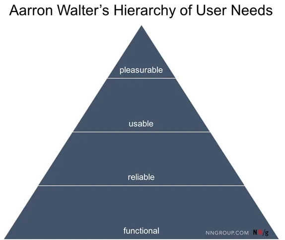 Image Credit: NNGroup
Also, in terms of user experience, UX designers stress more on usability so
that users' journeys are as smooth as possible.
Hence, when there is a clear indication for the approval of the overall design
direction, you can proceed to focus on making the user interface (UI)
pleasurable and digestible by arranging visual elements.
What is the Role of Visual Design in UX?
Similar to graphic design, visual design is all about beautifully and
creatively implementing colors, texts/fonts, and images to enhance user
experience (UX) and user interface (UI)
with your creative setup. This design field is new and is a
fusion of user interface (UI) design and graphic design.
The first primary goal of a visual designer is to make UIs usable—users are
naturally drawn to the correct functionality and information. Graphic
designers prioritize content on a web page through various means (as discussed
above) to make it happen.
Designers can then add elements of delight like animated effects with crisp
illustrations into their app designs to make the UI more attractive and
intuitive.
Visual Design Principles for Visual Designers
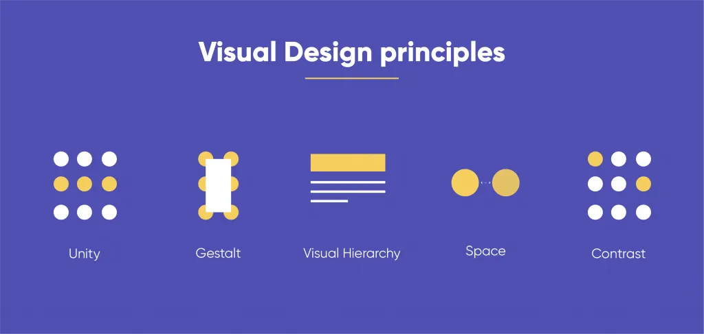
To make sense of your visual design, you need a set of standards to follow.
They are better known as design principles that effectively combine all the
discussed design elements. Consider the following design principles
and make it a practice to use them -
Unity
It deals with all the elements on a web page visually or conceptually
appearing to belong together. As a visual designer, you must keep a balanced
unity to avoid overwhelming designs.
Gestalt
It helps users in perceiving the overall design as opposed to individual
elements. If the arrangement of design elements is straightforward, the
Gestalt of the overall design will be obvious.
Space
When you place something for your abstract idea, it's a space. __ Including
space in your design help reduces noise, increases readability, and creates an
illusion. For this, white/negative space is an integral part of your layout
strategy.
The Hierarchy
It shows the difference in significance between items. Designers often create
orders through different font sizes, colors, and placement on the page.
Usually, the virtual objects to perceive are always at the top.
Balance
It generates the perception that all the elements in a design have equal
distribution.
Note: It does not always imply that there is symmetry.
The contrast
Contrast is to make objects in the design stand out by emphasizing differences
in color, color, direction, and other characteristics.
The scale
The scale helps identify a range of sizes by creating interest and depth to
demonstrate how each item concerns the other based on its size.
Dominance
It focuses on having one element as the focal point and others as subordinate.
It is often done through scaling and contrasting based on size, color, shape,
position, etc.
Similarity
It stands for creating continuity throughout your design without direct
duplication. You can use similarity to make pieces work together over an
interface and help users learn the interface quicker.
Let’s see an example consisting of all of the above principles of visual
design -
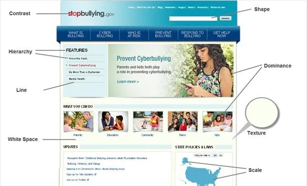 Image Source: Digital.Gov
Things used in the above webpage are -
- Application of color contrast to the logo, making the word Stop stand out.
- Size and text spacing for visual hierarchy
- The featured image dominates the smaller images by creating a focal point.
- White space around text and between sections for allowing the page to breath
- The background is Textured to assist the elements to stand out on top of the page.
- The Map shows scale .
- Lines divide sections on the page.
- Various shapes are creating different buttons.
How can designers create appealing user experiences that make people
explore more?
An excellent visual design always wins people's hearts and can improve their
overall user experience regarding a digital/physical product by making them
feel better whenever they interact.
Hence, here are a few things visual designers can apply to their visual
designs for a better UX -
Always go for Consistency in Design
Inconsistency in procedures of design methods and almost every other concept
leads to unusability and confusion and can easily make even the most beautiful
design useless. It also wastes users' time and effort to use a particular
product, no matter how beautiful it is.
So, to maintain consistency and avoid confusion and unusability, you can
create a style guide, define rules, and apply styles to layouts accordingly.
Visual hierarchy on every page/screen must be clear to understand
Visual hierarchy is for displaying items on a page/screen. And how well you
are in calling users' attention to them says a lot about a visual designer. A
clear visual hierarchy helps people communicate to your webpage/app and puts
the users' engagement to focus on necessary actions.
It is more vital to a web design since people can find your competitors'
website(s) a click away. If they can't find what they are looking for on your
webpage, they will immediately leave and not return.
Never forget to test visual concepts
Do not ever assume that people will like or love your design because it looks
good.
Without it, the whole creation around us is a place with no imagery. But to
visuals, we react strongly.
So, the imagery and colors undoubtedly influence your visitors/users on how
much they like your product.
Thus, test it with people and measure success based on user feedback/behavior,
and do not wait for the end of development; instead, use a prototype to test
your design decisions. Test it earlier and more often to be more confident
about design decisions.
Top 5 UX design trends to stand Out: Be careful!
Although trends originating from the research and development in designs can
make your visual design look intuitive and attractive to users, it's vital to
evaluate every trend.
Look for long-lasting trends because no visual designer would probably want to
invest time and effort in altering visual style(s) too often.
Let's see what design trends are there to follow in 2022 -
Anthropomorphic Animations
Anthropomorphism refers to attributing human emotions, intentions, and
characteristics to non-human objects. User experience designers
can involve Anthropomorphic Animations to turn abstract shapes
into likable moving characters that mimic humans.
Password-Less Login
Keeping passwords secure in an era of multiple accounts of an individual is
very confusing, according to the survey of 2005 Americans. This survey says
that 57% of people forget their passwords right after resetting them. Conversely, 65% feel that they should write their passwords down so they
don’t forget them.
Hence, forgetting passwords is a thing now, and you need to address it.
Material Design
Material design = a “Design Language System.” It is all about bringing life to
the material.
Bold Typography
Human attention span is 8 seconds today and is decreasing day by day. So, to
keep users hooked on your website/app is challenging. And that’s why brands
are now pushing for large and bold typography in 2022.
Advanced Personalization
Personalization is integral to the essentials of UI/UX design. Today,
delivering highly targeted and personalized content is in top trend.
For example, you might have noticed how you receive personalized
suggestions for music, movies, videos, various content streaming websites like
Netflix, Amazon Prime, etc., and apps like Spotify.
Conclusion
Frankly speaking, visual design is all about convincing visitors that enter
your website since it takes only a few seconds for your website to make a
first impression on them.
And you're already aware of two things -
- Beauty is the first test, and
- The First impression is the last.
Both are usually based on what website visitors see and observe. They
will start interacting and evaluating it from all different aspects. Thus,
investing time, effort, and research into the visual design will help you
create an incredible first impression for your visitors/users.