Did you notice something unusual in your iOS apps?
It could be anything: app launch time, frequent crashes, over usage of battery or data due to massive requests.
All such things make the app sluggish.
In this blog post, we'll discuss the iOS best practices for optimizing your apps for different screen sizes and resolutions.
We'll also share some tips on testing your apps on different devices to ensure they're optimized properly. By following the tips in this blog post, you can ensure that your iOS apps will look great and be easy to use on all devices. This will undoubtedly lead to improved user experiences, increased app downloads, and improved app ratings.
Also, if you're looking for professional help with your iOS app development, consider hiring an experienced iOS app development company. Their expertise can ensure that your app is optimized to perfection.
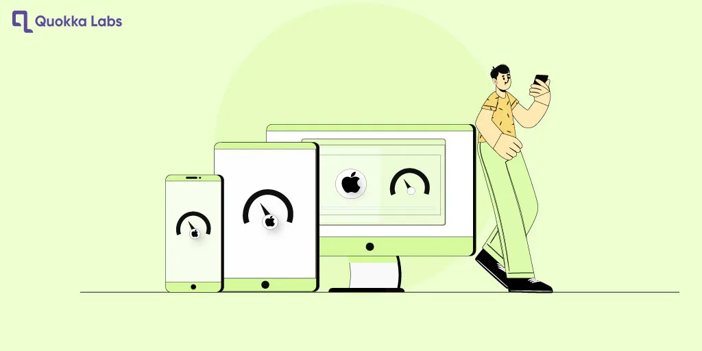
iOS App Optimization: Tips for Screen Sizes & Resolutions

With the increasing variety of iOS devices on the market, optimizing your apps for different screen sizes and resolutions is more critical than ever. It ensures that your app will look great and be easy to use on all devices, regardless of size or pixel density.
Before we dive into the tips and iOS best practices, it is essential to understand the root causes of encountering performance issues by conducting a thoughtful approach.
-
Gauge the reviews and feedback you’ve received from the end users to gather the UI/ UX behaviors.
-
Use some apps to evaluate the app performance area of improvements.
-
Get the suggestions and implement them one by one, considering complexity.
-
Keep monitoring the app's performance to avoid future performance obstacles and keep the app running flawlessly.
So, please take advantage of the opportunity to create an exceptional user experience for your iOS app users by optimizing it for various screen sizes and resolutions!
Top Tips to Optimize iOS Apps for Different Screen Sizes and Resolutions

If you're looking to improve the user experience of your iOS apps and attract more users, then optimize your apps for different screen sizes and resolutions. The tips in this blog will help you to make a responsive iOS app design and more. But before that, let's quickly understand iOS Screen Sizes and Resolutions.
Understanding iOS Screen Sizes
Today there are various resolution iOS devices found; here is the list.

Most devices still have a user base, so you can hire iOS app developer who will optimize the apps to work smoothly on most devices with variable screen sizes.
So now, let's discover tips for iOS app optimization for screen sizes and making responsive iOS app designs.
Also read: A Step-by-Step Guide to iOS App Development
Use Auto Layout to Create a Responsive UI

Auto Layout is an influential tool that allows you to create a UI that will automatically resize and reflow to fit different screen sizes and resolutions. This is the best way to ensure your app looks great and is easy to use on all devices.
To use Auto Layout, you must create a set of constraints defining how your UI elements should be positioned and sized. These restrictions can be based on the size of the device's screen, the size of other UI elements, or absolute values.
For example, you could create a constraint that specifies that a button should be centered on the screen and have a width of 100 points. This constraint will ensure that the button will be centered on the screen and have a width of 100 points, regardless of the size of the device's screen.
Auto Layout can be tricky to learn initially, but it's worth the effort. Once you understand how it works, you can create responsive UIs on all devices.
Here are some tips for using Auto Layout:
-
Use size classes to define the different screen sizes and resolutions that your app will support
-
Use constraints to control the layout of your UI elements
-
Use the safe area to avoid cutting off elements on devices with rounded corners
-
Test your app on different devices to make sure it's optimized correctly
Design For Different Screen Densities
Not all iOS devices have the same pixel density. For example, the iPhone 13 Pro Max has a much higher pixel density than the iPhone SE (2nd generation). You must design your app for different screen densities to ensure it looks good on all devices.
There are a few things you can do to design for different screen densities:
Here are some tips for designing for different screen densities:
- Use High-Resolution Assets
Best-preferred practice for iOS app development for various resolutions using images and videos that have a high number of pixels. It will ensure your app looks sharp and crisp on devices with high pixel densities.
These images are created using mathematical formulas. It means that they can be scaled to any size without losing quality. It is a good option for photos on devices with different screen densities.
- Use A Design System That Supports Different Screen Densities
A design system is a collection of reusable UI components and patterns. It can help you create a consistent UI across all devices, regardless of screen density.
Provide High-Quality Assets for All Devices
This iOS app optimization for screen sizes includes things like images, videos, and fonts. Ensure your assets are high-resolution to look good on all devices, even those with high pixel densities.
You should use assets with a minimum of 1080p resolution for images and videos. For fonts, you should use fonts that have a minimum of 200 points.
Here are some tips for providing high-quality assets for all devices:
Use Size Classes to Define the Different Screen Sizes and Resolutions That Your App Will Support
Size classes are a way of grouping different screen sizes and resolutions. This iOS app development for various resolutions makes creating a UI that will work on all devices easier.
There are three size classes:
-
Compact: This size class represents small screens, such as the iPhone SE (2nd generation)
-
Regular: This size class represents medium screens, such as the iPhone 13 Pro
-
Significant: This size class represents large screens, such as the iPad Pro (12.9-inch)
When you use size classes, you can create a UI that will automatically resize and reflow to fit different screen sizes and resolutions. It is a great way to ensure your app looks great and is easy to use on all devices.
Use Constraints to Control the Layout of Your UI Elements
Constraints are a way of specifying how your UI elements should be positioned and sized. It is essential for creating a responsive UI.
There are two types of constraints:
Relative Constraints
These constraints specify how your UI elements should be positioned relative to each other. For example, determine that a button should be 10 points below a text field.
Also Read: Ios Apps for Wearables Watchos Healthkit
Absolute Constraints
These constraints specify how your UI elements should be positioned in absolute terms. For example, you could determine that a button should be 100 points from the top of the screen.
You can combine relative and absolute constraints to create a responsive UI. For example, you could specify that a button should be 10 points below a text field and that the button should be 100 points from the left edge of the screen. It will ensure that the button will always be positioned correctly, regardless of the size of the device's screen.
Use The Safe Area to Avoid Elements Being Cut Off on Devices with Rounded Corners
The safe area is an area of the screen unaffected by some devices' rounded corners. This means you can place UI elements in the safe room without worrying they will be cut off.
The safe area is defined by a rectangle inset from the edges of the screen by 44 points on the top and bottom and 20 points on the left and right.
If you place UI elements in the safe area, you can be sure they will always be visible, even on devices with rounded corners.

Use A Design System to Help You Create a Consistent UI Across All Devices
A design system is a collection of reusable UI components and patterns. It can help you create a consistent UI across all devices, improving your app's user experience.
A design system can also help you to save time and effort when designing your app. You can use the components and patterns already available in the design system rather than creating them from scratch.
Use A Responsive Design Approach

A responsive approach means you design your app to be supple and flexible to different screen sizes and resolutions. This is an excellent way to ensure your app looks great and is easy to use on all devices.
When you use a responsive design approach, you should use the following principles:
-
Use relative sizing instead of absolute sizing
-
Use supple layouts that can adapt to different screen sizes
-
Use media queries to control the layout of your app on different screen sizes
Suggesting Tools to Optimize iOS Apps Performance
Xcode Instruments Comprehensive Performance Analysis
It’s iOS app programmers' choice for intense analysis to discover the memory leaks, rendering, UI, and CPU-related bottlenecks.
TestFlight Crash Reports for Beta Testing
Before you expose the app for production perform beta testing. Test how much your app is stable collecting crash log insights.
CocoaLumberjack or OSLog for Debugging
Evalaute the logs and specific patterns degrading the performance of your iOS app.
Final Snippets
In conclusion, optimizing iOS apps for diverse screen sizes and resolutions is crucial for a seamless user experience. Adopting adaptive layouts, dynamic type, and other iOS best practices ensures your app reaches a broader audience and performs exceptionally well on all iOS devices.
Get to know more about iOS app development cost and optimization assistance, contact our experienced team at Quokka Labs. Let's create remarkable apps together!
FAQ's About iOS App Optimization for Screen Sizes
Q1: Why is optimizing iOS apps for different screen sizes significant?
Ans: Optimizing apps ensures a consistent and delightful user experience across iOS devices.
Q2: What are Adaptive Layouts?
Ans: Adaptive Layouts use Auto Layout and Size Classes to create flexible interfaces that adapt to different screen sizes.
Q3: How can I handle different text sizes?
Ans: Use Dynamic Type and predefined text styles to ensure text remains legible regardless of the user's preferences.
Q4: What are Asset Catalogs used for?
Ans: Asset Catalogs organize and manage image assets for different screen resolutions and device sizes.
Q5: Why is testing on real devices essential?
Ans: Testing on physical devices provides accurate insights into the app's performance on various screen sizes and resolutions.
Q6: How can I optimize for both portrait and landscape orientations?
Ans: Utilize Adaptive Layouts to ensure a seamless user experience when the device rotates.
Q7: Should I design different navigational elements for each device?
Ans: Prioritize essential navigation options and use collapsible menus to maintain a clean interface.
Q8: How do I handle performance optimization?
Ans: Implement lazy loading, cache data, compress images, and limit excessive animations for improved performance.
Q9: What should I consider when designing for different iPad modes?
Ans: Support multitasking in Split View and verify the app's functionality in Slide Over mode.
Q10: Why should I provide app extensions?
Ans: App extensions enhance user convenience and increase app discoverability.
Q11: Is app localization important?
Ans: Localizing your app for different languages and cultural preferences expands your user base.
Q12: How can I optimize for right-to-left languages?
Ans: Test and ensure your app's user interface adjusts correctly for right-to-left reading.
Q13: What benefits does optimizing for different screen sizes bring?
Ans: Optimization increases user satisfaction, retention, and broader market reach.
Q14: What tools can I use to handle keyboard presentation?
Ans: Implement keyboard handling using UIScrollView and UITableView for smooth user interaction.
Q15: How can I ensure my app's icon looks great in different appearances?
Ans: Design Adaptive Icons with multiple sizes and modes to accommodate various system themes.
Tags
iOS App Design
design
ios app
developer
Technology
development