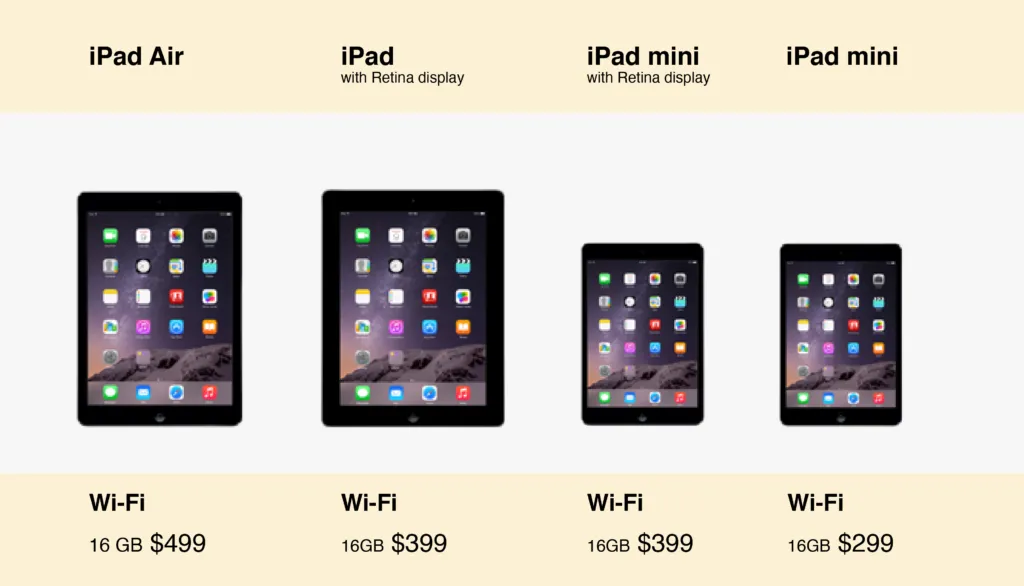
It's the experience. The website layout: feature display, user flow management, and product launches are some of the "perception builders" for your company. They make your company look rich and professional and provide exploratory insights into your product selling stats, which you can use to remap your sales structure. The best way to design is to understand how your consumers perceive your product. A simple example is comparing smartphones/tabs:
Due to the availability of multiple versions/companies for a single product type, users tend to compare several Of them: matching features with features. So, one excellent way to facilitate easy comparison is to have an easy-to-view chart to see the differences at a glance.
Common mistakes in E-commerce Website
Choosing All Themes & Plugins
Several times, web designers get tempted to focus on more attractive looks on a website rather than on critical features required for the task. Instead, while selecting a theme for your online store, first list all the essential features of your store. After that, it's up to you whether to go with a ready-made theme with built-in features piece to which you can add custom code, or better:
Codee your music from scratch: personalize the entire design! Another essential thing to remember is to maintain a standard design methodology. The thing is, most shoppers have become familiar with a specific Format for websites of online stores.
Here are some examples:
- Shopping cart in the top-right corner
- Easy zoom-in feature
- Contact details on header or footer
- Thumbnail viewing of product images, etc.
I want to emphasize that try not to force your user to search for buttons to click. Ensure clear Call To Action (CTAs) from the initial homepage to product display and shopping cart to checkout.
Slow Loading Sites
Losing your customer because of a slow-loading webpage can be costly as you have already invested some resources in acquiring them. Shoppers searching for products expect e-commerce pages to load instantly to view more no. of products.
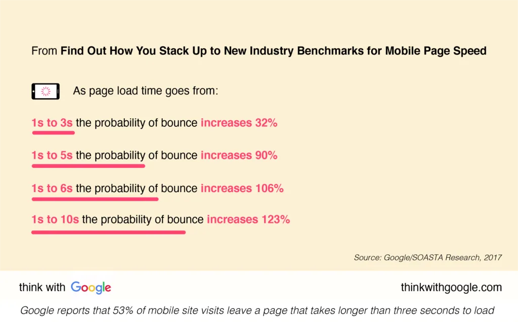
Hence, slow-loading pages kill any shopping experience. In browsing, users ideally access remote files stored in the web servers. The faster the remote computer, the quicker the user will access the requested pages. That makes your choice of web hosting company or package very important.
So, it's better to use a quality VPS or cloud hosting option, especially since Google announced that it would consider webpage loading speed while ranking pages. This website mistake can be a technical issue. Therefore, getting your developer involved is essential to find ways to improve the page load time for an existing website.
No Mobile-Site Experience
With increasing smartphone distribution, mobile visits are gaining momentum over desktops. So, if you want to optimize your store for anytime-anywhere purchases, and invest quality time and developers in building an excellent mobile experience.
67% of users say they are more likely to buy a product from a mobile-friendly site. Also, 57% of users say they will not recommend a business with a poorly designed mobile site.
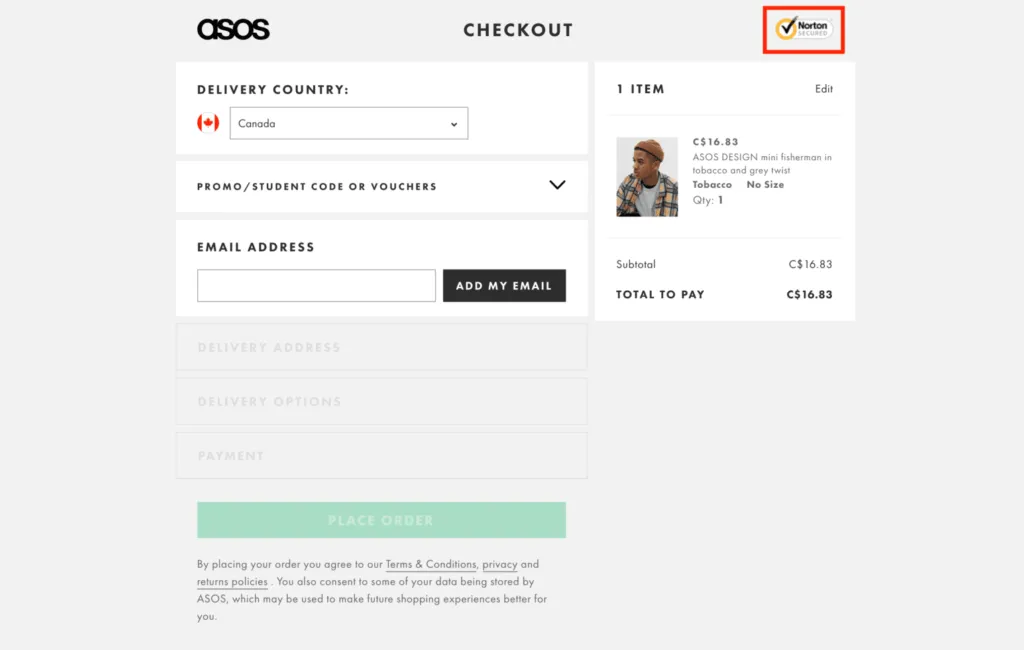
Organic customer acquisition usually comes from user-user referrals or recommendations. A good mobile experience can uplift your brand recognition and shall be embraced with loyalty. Thus, while tailoring your website for mobile compatibility, remember to send out all the trust signals –transparent logo, secure website, contact details, testimonials, reliable payment
options and gateways, and no spam.
Reviews are Invisible
E-commerce customers are very selective about what they purchase, and the best option is to get them helpful reviews just when viewing the product. Based on a survey of U.S. mom internet users, people trust consumer reviews nearly 12 times more than the descriptions provided by
manufacturers. Many e-commerce sites either fail to sport a descriptive review visualization or users must dig deep to view them.
This is a significant shopping experience killer as the user feels lost about the product. Even if your layout is such that the reviews can't be formatted along with the product, it's advisable to feature a CTA to direct the user to the same. Several times, a product review gets spammed by irrelevant marketing. You can filter out those by using tags like "Verified Customer, and" Recent Purchaser: this amounts to a more fantastic shopping experience.
Another addition is a segmented review system: that uses sentiment analysis to sort which reviews are positive, negative, or others. This helps, especially when a product has 100+ reviews, and you can't expect the user to go line-by-line through each.
Forced Account Creation & Time-Consuming Checkout Process
A multi-step checkout process is another mistake often made by many e-commerce sites. The drawback is that you are making your customer impatient, as you would be annoyed standing in a long queue at a billing counter. Also, initial account creation before viewing products brings terrible experiences to a newbie user even after hopping onto your website from your marketing campaigns. Cart abandonment is almost inevitable in these cases.
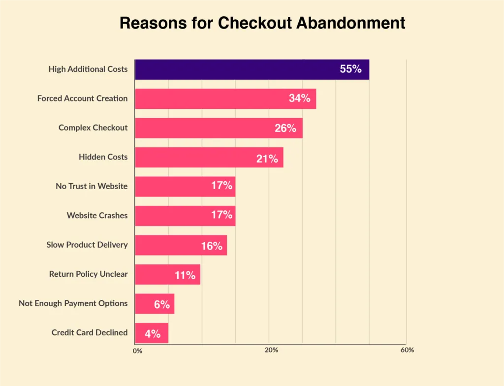
Forced account creation is 2nd, and Complex Checkout is the 3rd most common factor for cart abandonment[/caption]. To ensure a hassle-free and smooth checkout, offering multiple payment options suited to different customer profiles or geographies is a good idea. Take a cue from this example: for the billing address, instead of asking the user to fill up the entire form, you can perform any one of the two:
- For a first-timer, start with the pin code and GPS location: one click will give you the address.
- Direct them to the address fill-up form only if the delivery address differs from their current location.
- The next time they purchase from your store, view the saved addresses to select.
Offering these options on a single screen reduces the number of clicks or taps a user has to make before completing a transaction. Also never forget to optionally remind the user of an existing coupon code or gift cards remaining to be used. This shall enhance customer satisfaction and improve retention rates after purchase.
Forced account creation blocks their buying process, adds a step, and makes purchasing more difficult and time-consuming. Instead, consider following up with a customer, requesting that they sign up or register with your service after the sale. Funneling customers to the point of purchase requires much effort, including marketing, product development, distribution channels, and more. Once customers are in the checkout process, you want to capitalize as
much as possible:
- Employ clear CTAs for the checkout process
- Create Minimuform fields and deploy automatic filling-up of user data
- Offer multiple payment options
- Account Creation notification after the sale has been made
Last Snippets
Though we have covered the five most prominent mistakes, there are always some tweaks that you can perform from time to time and see which combination is most beneficial to your e-commerce strategy. Just have a glance at the checklist before bringing your website into production:
- Monitor your website analytics by having Google Analytics installed. It's beneficial.
- Consider putting a visible contact number in the header and contact page.
- Keep your page load speed optimized to keep visitors engaged.
- Publish blog content regularly, focus on long-tail keywords, and share it on social media.
- Customise your product messaging according to your audience.
- Use a solid call to action (CTA) that drives users down the path you want them to.
Tags
Website Development
E-commerce Website Development